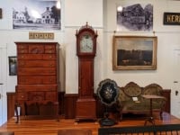
Harvard Historical Society
Discover Your Town
Post about a past or future event. — Includes an Events Section where you can enter the date, time, location,…
Header side bars Help
Bar Headline
Content, plain. Lorem ipsum dolor sit amet, consectetur adipiscing elit. Mauris vel ante non metus dictum sagittis. Duis et malesuada felis, vel commodo tellus. Nam eu arcu pellentesque, fringilla orci eu, euismod nisl. Suspendisse gravida porttitor fringilla. Ut rutrum ex ut consectetur venenatis.
Content, dark background. Lorem ipsum dolor sit amet, consectetur adipiscing elit. Mauris vel ante non metus dictum sagittis. Duis et malesuada felis, vel commodo tellus. Nam eu arcu pellentesque, fringilla orci eu, euismod nisl. Suspendisse gravida porttitor fringilla. Ut rutrum ex ut consectetur venenatis.
Content, dark background + border. Lorem ipsum dolor sit amet, consectetur adipiscing elit. Mauris vel ante non metus dictum sagittis. Duis et malesuada felis, vel commodo tellus. Nam eu arcu pellentesque, fringilla orci eu, euismod nisl. Suspendisse gravida porttitor fringilla. Ut rutrum ex ut consectetur venenatis.
Lorem ipsum dolor sit amet, consectetur adipiscing elit. Mauris vel ante non metus dictum sagittis. Duis et malesuada felis, vel commodo tellus. Nam eu arcu pellentesque, fringilla orci eu, euismod nisl. Suspendisse gravida porttitor fringilla. Ut rutrum ex ut consectetur venenatis.
Posts selection
Example: Future Event – History of Clinton Shores
Example: Article from Author – Fire at the Meeting House

Box with slider
No colored background.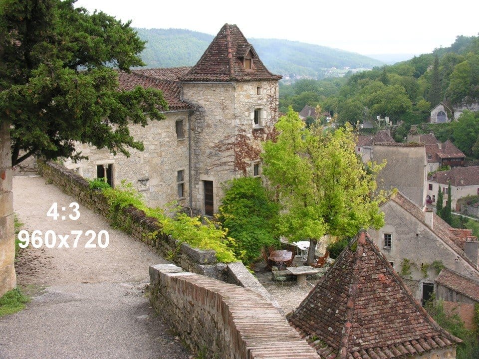
Lorem ipsum dolor sit amet, consectetur adipiscing elit. Mauris vel ante non metus dictum sagittis. Duis et malesuada felis, vel commodo tellus. Nam eu arcu pellentesque, fringilla orci eu, euismod nisl. Suspendisse gravida porttitor fringilla.
Box headline (h2)
Box subheadline
Body text centered. Lorem ipsum dolor sit amet, consectetur adipiscing elit. Mauris vel ante non metus dictum sagittis.
Title headline
With a subheadline...Body text. Lorem ipsum dolor sit amet, consectetur adipiscing elit. Mauris vel ante non metus dictum sagittis. Duis et malesuada felis, vel commodo tellus. Nam eu arcu pellentesque, fringilla orci eu, euismod nisl. Suspendisse gravida porttitor fringilla. Ut rutrum ex ut consectetur venenatis. Suspendisse et purus ante. Nam condimentum enim in lobortis ornare. Quisque ultricies quam nec tortor pulvinar porttitor. Sed vestibulum euismod fringilla.
Posts: Selection
Example: Author – Carlene Phillips

Example: Author – Patrick Vallaeys

Posts: Featured (2, colored bg)
Posts: Topic (3)
Body text. Lorem ipsum dolor sit amet, consectetur adipiscing elit. Mauris vel ante non metus dictum sagittis. Duis et malesuada felis, vel commodo tellus. Nam eu arcu pellentesque, fringilla orci eu, euismod nisl. Suspendisse gravida porttitor fringilla. Ut rutrum ex ut consectetur venenatis. Suspendisse et purus ante. Nam condimentum enim in lobortis ornare. Quisque ultricies quam nec tortor pulvinar porttitor. Sed vestibulum euismod fringilla.
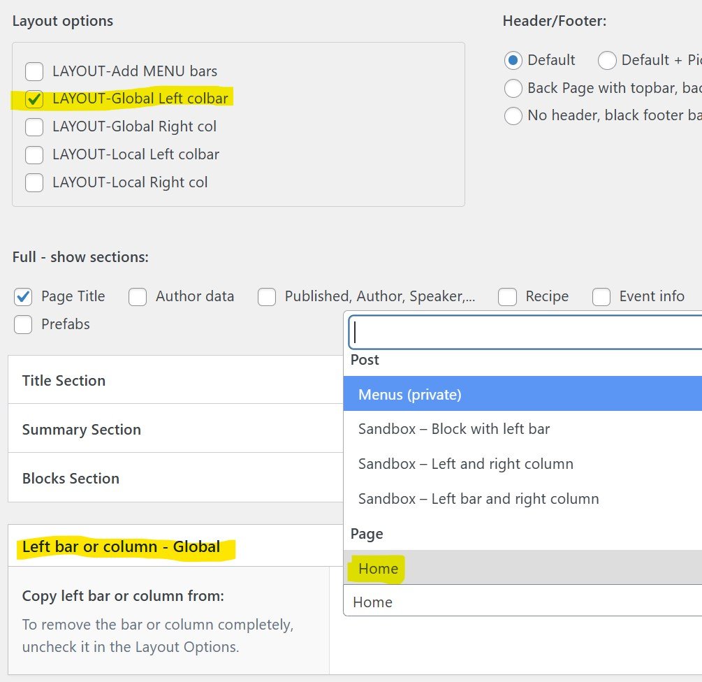
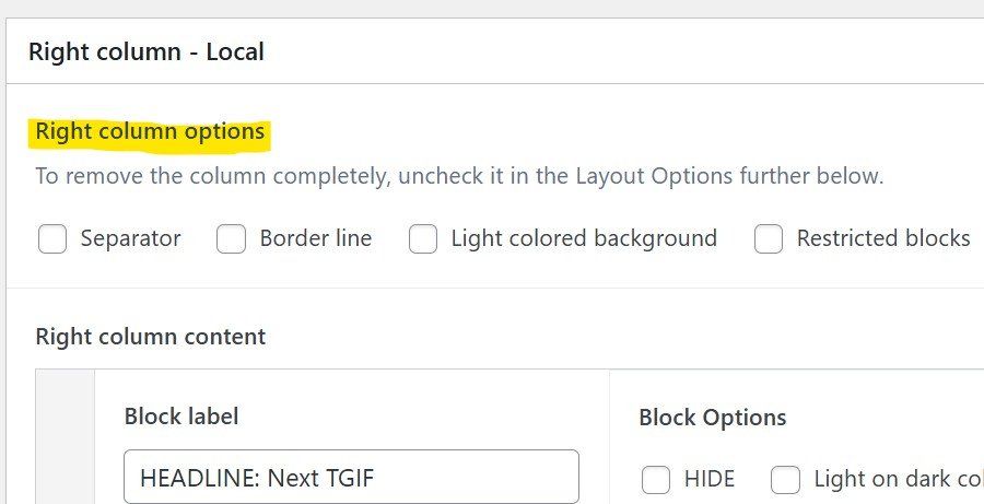
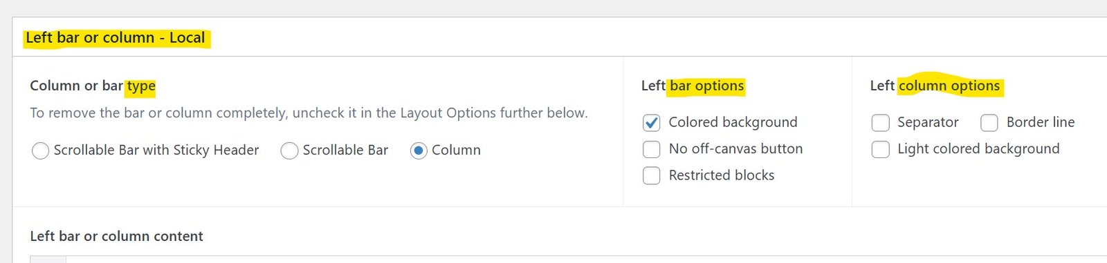
Side bars and columns
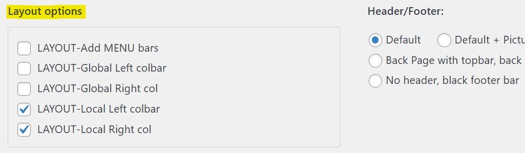
To add a column to the right or the left of your post, check the appropriate boxes in the Layout options of your page or post.
Notes:
Note: only show up if you select the type Column
Here is what happens on smaller screens (try it by narrowing the window!):
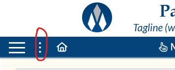
Note: in certain cases this icon does the same as the Burger Icon left of it. In this case you have the option to hide it by checking No off-canvas button in the Left Bar Options
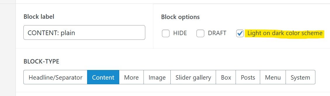
The content is defined in Blocks. The examples on this post include most of the block types available for bars and columns.
Lorem ipsum dolor sit amet, consectetur adipiscing elit. Mauris vel ante non metus dictum sagittis. Duis et malesuada felis, vel commodo tellus. Nam eu arcu pellentesque, fringilla orci eu, euismod nisl. Suspendisse gravida porttitor fringilla. Ut rutrum ex ut consectetur venenatis.

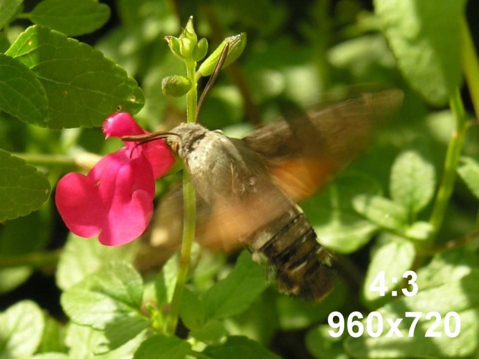
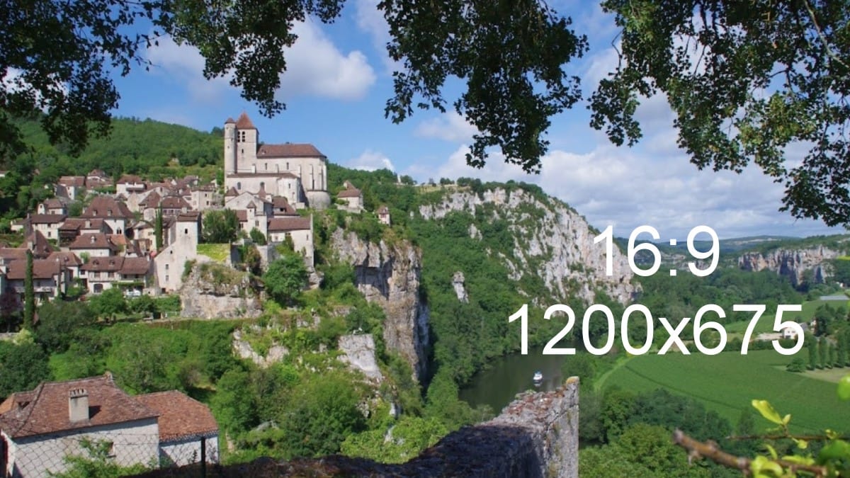
Example: Past Event – Saint-Cirq-Lapopie
Example: Recipe – Corn Relish

Content border. Lorem ipsum dolor sit amet, consectetur adipiscing elit. Mauris vel ante non metus dictum sagittis. Duis et malesuada felis, vel commodo tellus. Nam eu arcu pellentesque, fringilla orci eu, euismod nisl. Suspendisse gravida porttitor fringilla. Ut rutrum ex ut consectetur venenatis.
Content colored. Lorem ipsum dolor sit amet, consectetur adipiscing elit. Mauris vel ante non metus dictum sagittis. Duis et malesuada felis, vel commodo tellus. Nam eu arcu pellentesque, fringilla orci eu, euismod nisl. Suspendisse gravida porttitor fringilla. Ut rutrum ex ut consectetur venenatis.
Content border colored. Lorem ipsum dolor sit amet, consectetur adipiscing elit. Mauris vel ante non metus dictum sagittis. Duis et malesuada felis, vel commodo tellus. Nam eu arcu pellentesque, fringilla orci eu, euismod nisl. Suspendisse gravida porttitor fringilla. Ut rutrum ex ut consectetur venenatis.
Content dark bg. Lorem ipsum dolor sit amet, consectetur adipiscing elit. Mauris vel ante non metus dictum sagittis. Duis et malesuada felis, vel commodo tellus. Nam eu arcu pellentesque, fringilla orci eu, euismod nisl. Suspendisse gravida porttitor fringilla. Ut rutrum ex ut consectetur venenatis.
Headline title
Private: Example: Past Event – Saint-Cirq-Lapopie
A French Medieval VillageMore about this...
Headline in the box on two lines.

Content in a box
Lorem ipsum dolor sit amet, consectetur adipiscing elit. Mauris vel ante non metus dictum sagittis.
Boxbar Header
Subheadline
Content. Lorem ipsum dolor sit amet, consectetur adipiscing elit. Mauris vel ante non metus dictum sagittis. Duis et malesuada felis, vel commodo tellus. Nam eu arcu pellentesque, fringilla orci eu, euismod nisl. Suspendisse gravida porttitor fringilla. Ut rutrum ex ut consectetur venenatis.
...
subheadline
Content. Lorem ipsum dolor sit amet, consectetur adipiscing elit. Mauris vel ante non metus dictum sagittis. Duis et malesuada felis, vel commodo tellus. Nam eu arcu pellentesque, fringilla orci eu, euismod nisl. Suspendisse gravida porttitor fringilla. Ut rutrum ex ut consectetur venenatis.
Posts: Selection (2)
Example: Article from Author – Fire at the Meeting House
Example: Author – Patrick Vallaeys
Posts Featured
Posts: Topic (4)
Header side bars Help
Bar Headline
Content, plain. Lorem ipsum dolor sit amet, consectetur adipiscing elit. Mauris vel ante non metus dictum sagittis. Duis et malesuada felis, vel commodo tellus. Nam eu arcu pellentesque, fringilla orci eu, euismod nisl. Suspendisse gravida porttitor fringilla. Ut rutrum ex ut consectetur venenatis.
Content, dark background. Lorem ipsum dolor sit amet, consectetur adipiscing elit. Mauris vel ante non metus dictum sagittis. Duis et malesuada felis, vel commodo tellus. Nam eu arcu pellentesque, fringilla orci eu, euismod nisl. Suspendisse gravida porttitor fringilla. Ut rutrum ex ut consectetur venenatis.
Content, dark background + border. Lorem ipsum dolor sit amet, consectetur adipiscing elit. Mauris vel ante non metus dictum sagittis. Duis et malesuada felis, vel commodo tellus. Nam eu arcu pellentesque, fringilla orci eu, euismod nisl. Suspendisse gravida porttitor fringilla. Ut rutrum ex ut consectetur venenatis.
Lorem ipsum dolor sit amet, consectetur adipiscing elit. Mauris vel ante non metus dictum sagittis. Duis et malesuada felis, vel commodo tellus. Nam eu arcu pellentesque, fringilla orci eu, euismod nisl. Suspendisse gravida porttitor fringilla. Ut rutrum ex ut consectetur venenatis.
Posts selection
Example: Future Event – History of Clinton Shores
Example: Article from Author – Fire at the Meeting House
Box with slider
No colored background.Lorem ipsum dolor sit amet, consectetur adipiscing elit. Mauris vel ante non metus dictum sagittis. Duis et malesuada felis, vel commodo tellus. Nam eu arcu pellentesque, fringilla orci eu, euismod nisl. Suspendisse gravida porttitor fringilla.
Box headline (h2)
Box subheadlineBody text centered. Lorem ipsum dolor sit amet, consectetur adipiscing elit. Mauris vel ante non metus dictum sagittis.
Title headline
With a subheadline...Body text. Lorem ipsum dolor sit amet, consectetur adipiscing elit. Mauris vel ante non metus dictum sagittis. Duis et malesuada felis, vel commodo tellus. Nam eu arcu pellentesque, fringilla orci eu, euismod nisl. Suspendisse gravida porttitor fringilla. Ut rutrum ex ut consectetur venenatis. Suspendisse et purus ante. Nam condimentum enim in lobortis ornare. Quisque ultricies quam nec tortor pulvinar porttitor. Sed vestibulum euismod fringilla.
Posts: Selection
Example: Author – Carlene Phillips
Example: Author – Patrick Vallaeys
Posts: Featured (2, colored bg)
Posts: Topic (3)
Body text. Lorem ipsum dolor sit amet, consectetur adipiscing elit. Mauris vel ante non metus dictum sagittis. Duis et malesuada felis, vel commodo tellus. Nam eu arcu pellentesque, fringilla orci eu, euismod nisl. Suspendisse gravida porttitor fringilla. Ut rutrum ex ut consectetur venenatis. Suspendisse et purus ante. Nam condimentum enim in lobortis ornare. Quisque ultricies quam nec tortor pulvinar porttitor. Sed vestibulum euismod fringilla.

